![]()
How to make a graph that shows the
correlation between unemployment figures and support for political parties
Zhenia Plotnikova Y10 –
2003
- Make a table in Excel. Write title in the first four columns, considering things that you want to place on y-axis (e.g. ‘Nazi’, ‘Centre’, ‘Communists’, ‘SPD’) and fifth column considering line type of graph (e.g. ‘unemployment’). Name sixth column considering the text you are going to put on x-axis (e.g. ‘Years’)
- Enter the numbers that you need in each column (e.g. number of votes in columns ‘SDP’, ‘Centre’, ‘Nazi’, ‘Communists’, number of unemployed in column ‘Unemployment’ and years in column ‘Years’)
- Highlight the whole table, except the part you want to put as a note on x-axis. In my example it will look like this:
|
Nazi |
Centre |
Communists |
SDP |
Unemployment |
Years |
|
1,918,000 |
3,914,000 |
3,693,000 |
6,009,000 |
|
1924 |
|
907,000 |
4,119,000 |
2,709,000 |
7,881,000 |
|
1924 |
|
|
|
|
|
2,030,646 |
1925 |
|
|
|
|
|
1,827,200 |
1926 |
|
|
|
|
|
1,333,155 |
1927 |
|
810,000 |
3,712,000 |
3,264,000 |
9,158,000 |
1,721,594 |
1928 |
|
|
|
|
|
3,365,811 |
1929 |
|
6,409,000 |
4,127,000 |
4,592,000 |
8,577,000 |
4,971,843 |
1930 |
|
|
|
|
|
6,128,429 |
1931 |
|
13,745,000 |
4,589,000 |
5,283,000 |
7,959,000 |
6,013,612 |
1932 |
|
11,737,000 |
4,230,000 |
5,980,000 |
7,248,000 |
|
1932 |
- Click on the ‘Chart Wizard’ button on your toolbar or got to ‘Insert’ and then click ‘Chart’.
- The window with different chart types will look like this:
![]()
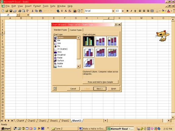
Here
in ‘Standard Types’ click column and choose the first type of it (look at the arrow)
and in ‘Custom Types’ click ‘Line-Column on 2 Axes’
6. Click next. In this window go to ‘Series’ and click on
the button in the corner of the row ‘Category (X) axis labels’. Select the column with years and click on
the corner button in the new appeared window. Click ‘Next’.
7. In this new window you can title all the axes.
(Category (X) axis – ‘years’, value (Y) axis – ‘votes’, secondary value (Y)
axis – ‘unemployment’). Click ‘Next’.
8. In new window click ‘Place chart as new sheet’ and
then ‘Finish’.
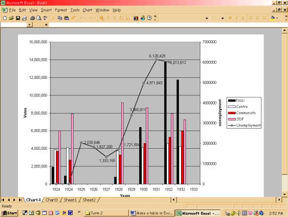
9. In my example I got ‘SPD’ column as a line chart type. To change it, right click on the Plot Area, go to ‘Chart type’ and change it to column. When all of the structures became columns, right on the structure that should be a line, ‘Change chart type’, double click on ‘Lines’. Now with a right click on any structure of the chart you can format it. Finally you should get something like this: